Industrial Safety Banner Strategy — Visuals, Messaging, and Deployment
Visual Design and Layout
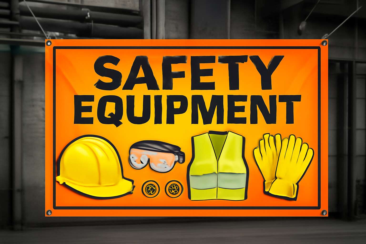
Industrial spaces demand banners that grab attention before the hazard becomes real. In South Africa, banners face bright sun and multilingual crews, so high-contrast visuals are essential. A well-crafted safety equipment banner boosts noticeability and reinforces procedures before a lapse occurs!
Key visual elements to consider:
- High-contrast color palettes for sunlight visibility
- Clear, legible typography at practical sizes
- Universal pictograms that transcend language barriers
Messaging should be concise and directive, aligning with the banner’s visuals while avoiding clutter. Deployment and layout should feel intentional, balancing eye flow, typography, and imagery to convey urgency without overwhelming readers. A safety equipment banner reinforces safety culture on the shop floor.
Messaging and Copy Strategy
In South Africa’s sun-scorched workshops, a well-tuned safety equipment banner can turn peril into prompt action. Its opening line should slice through glare and noise, guiding workers in moments when every second matters and turning safety into a shared habit.
Messaging must be crisp and directive, tuned for quick comprehension across languages. Short lines, present-tense verbs, and parallel structure help banners communicate instantly.
- Keep lines brief (4–7 words) for rapid scanning
- Use imperative verbs and present tense
- Pair text with universal pictograms
- Avoid jargon and regional idioms
Deployment ties it together: place the safety equipment banner where decisions happen—entrances, work zones, and break areas—ensuring legibility in bright sun and across shifts. When copy and placement align, safety becomes a daily reflex.
Branding and Accessibility
South Africa’s hottest workshops have learned a hard truth: bold signage saves seconds and, sometimes, lives. A plant tracked near-misses and found a 32% drop after deploying a striking safety equipment banner. That banner isn’t decoration—it’s a practical nudge toward safer habits.
Industrial safety banner strategy hinges on visuals that survive glare and busy minds. Use high-contrast colors, simple icons, and legible type. Pair branding with accessible layout so multilingual teams can read at a glance; these banners integrate where decisions occur, guiding actions without shouting.
Consider these key placements:
- Entrances and egress points
- Active work zones
- Break rooms and hand-washing stations
- Vehicle bays and loading docks
Accessibility means accommodating eye-sight variations and language diversity, not pandering to one group. A well-executed banner becomes part of daily routines, a quiet colleague who reminds everyone to act.
Production and Installation
“Visibility saves seconds, and seconds save lives,” a plant manager likes to say. In production and installation, the focus shifts from design to durability and fit. A safety equipment banner must withstand glare, heat, and factory dust while keeping legible copy and clear icons. Choose weather-resistant vinyl, UV-curing inks, and sturdy mounting hardware that won’t sag after a few shifts. The goal is a banner that enters the daily rhythm without becoming background noise, read at a glance in busy spaces.
- Placement at decision points and sightlines
- Secure mounting and vandal-resistance
- Language updates and easy replacement
Deployment considerations naturally follow—where and how banners are placed, who signs off, and how maintenance is scheduled without disrupting work. The banner should be easy to replace when branding changes or language updates are needed. A durable safety equipment banner becomes a quiet anchor for safer habits.

0 Comments